5 Tips on Designing Retail Displays to Boost Sales
Human beings are visual creatures. Half of our brains are responsible, either directly or indirectly, for processing visual information.
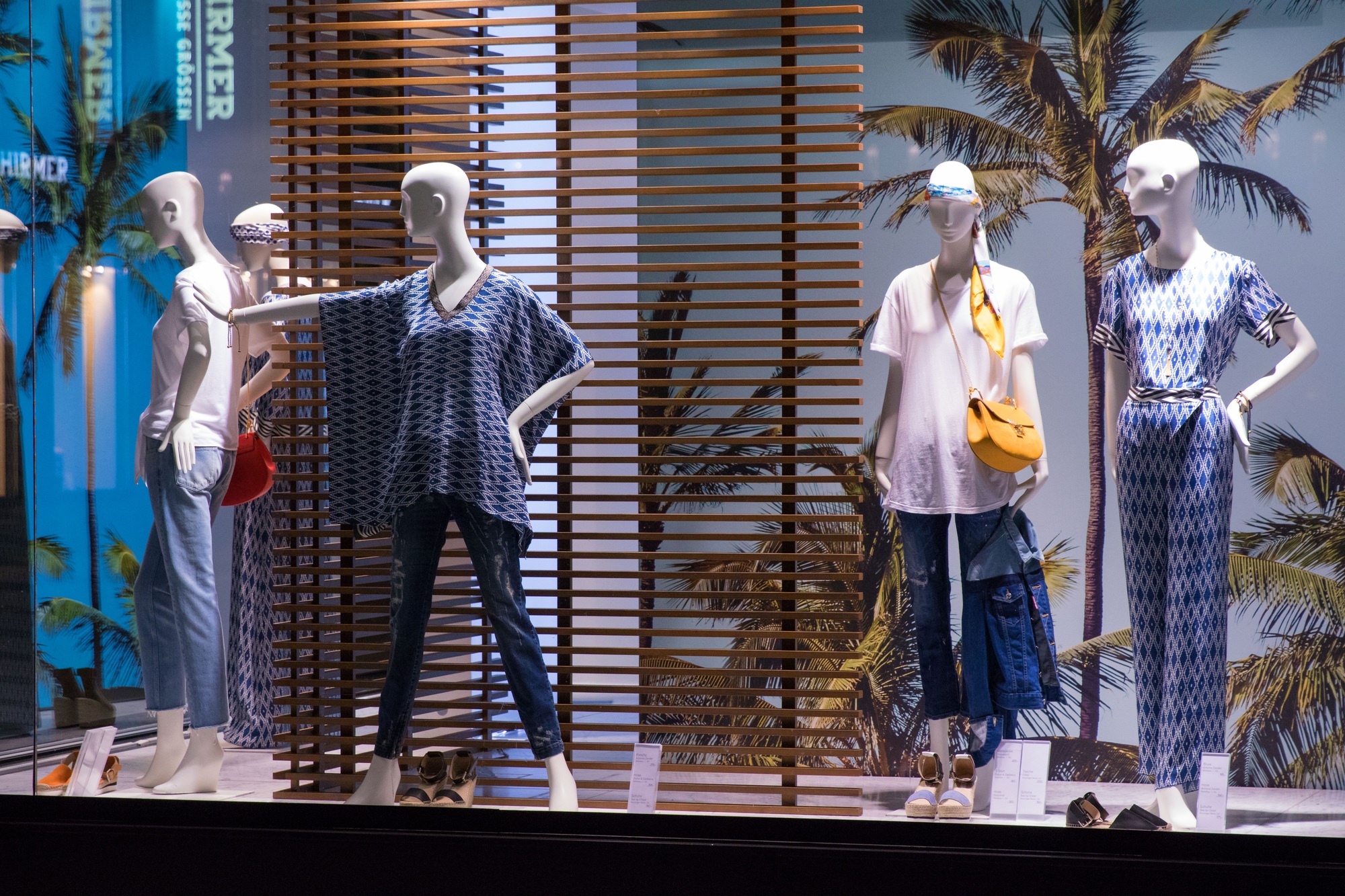
For businesses, taking advantage of this is key when it’s time to grab consumers’ attention. Designing retail displays is about catching and keeping the viewer’s focus—which can be hard within a crowded store environment. Taking time to create a thoughtful design can help you earn your customers’ attention, provided that you use five key tips when you consider display design ideas.
Contents
1. Entice Shoppers With Emotion
Research shows that we often buy based on emotion and justify the purchase with logic after the fact. In other words, it’s not the product itself that attracts buyers, but the emotion tied to a relevant benefit.
To make the most of emotion-based shopping, start by thinking about your display from an emotional perspective. Consider adding fun storytelling to your storefront windows, creating a themed display around your back-to-school products, or incorporating an exciting competition or contest into your messaging.
2. Consider the Flow of Traffic
It’s always a good idea to put your most interesting products in places customers will see early on. This is especially true of grocery store design, as large stores encourage customers to scatter to find the items on their shopping list.
Consider your store’s traffic patterns, and make the most of the area where visitors’ eyes will go first. For most U.S. shoppers, this means keeping a counterclockwise movement pattern in mind for your retail display layout.
3. Add Focal Points
Cluttered designs with too many display colors and visuals can quickly become overwhelming, making them less effective at drawing people in. No matter how many products you want to highlight, it’s always a good idea to have a single focal point to catch the eye. In most cases, you’ll want to place this statement piece at eye level, positioning any complementary items around it in a strategic way.
4. Create a Sense of Balance
Because your display is a visual medium, it helps to balance it in a way that’s pleasing to the eye. Consider the visual weight of each piece you add: darker and larger items tend to catch our attention with more ease than smaller, lighter-colored pieces, so consider how you’d like to break up the design. It helps to think about both the vertical and horizontal balance of the space—without forgetting that less is often more!
5. Don’t Forget the Lighting
The placement and composition of your display are important, but everything crumbles under the wrong lighting. Proper lighting should accentuate specific focal points while balancing the illumination of any complementary pieces.
Try These Tips When Designing Retail Displays
Creating an enticing visual experience is key when it comes to designing retail displays. With a little effort, your story, balance, location, and lighting can blend together to create the perfect focal point for your in-store traffic. Get started today to attract more customers to the products that matter!
Looking for more of the key business strategies you need to know? Be sure to take a look at our other guides for additional tips and tricks.


Comments are closed.