[Download] Chrome OS 61 Update Comes With New Login Screen and Bug Fixes
In September Google has announced that they will release Chrome 61 on Android and desktop and they have also confirmed some features that we would see when Chrome 61 goes live.
On Android devices Chrome added a lot of APIs that are amazing for developers and also focused on visual tweaks. For example, the address bar was moved at the bottom of the screen, there is a new improved Google Translate bar and more visual updates that will come on both Chrome 61 and Chrome OS 61 that was recently released to the public.
On Chrome OS 61 there is a new login and lock screen design. The old design had a profile picture in the middle of the screen and below the text box for the password. The new look is similar to the macOS one, that has a blurred wallpaper and in the middle the profile picture is round.
The Layout for the app Launcher Changes Too
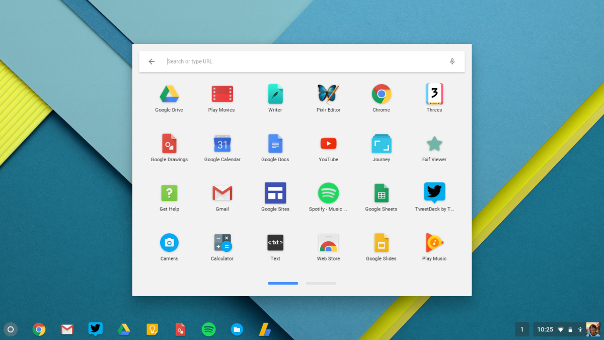
The app launcher has been changed too and is now live after a long time of tests to reach a stable stage. The new layout replaced the old one, with the old one that showed a card in the middle of the screen and that showed recent apps and a doodle with Google at the top. The new design will slide from the bottom of the screen upwards and will show you a search bar and the most recent applications that you have accessed.
Google is working on replacing the background that is a transparent black right now with a blurred background of the login screen. If you want to tap or swipe the up arrow, you will see all of your apps that are installed on your device.
Other new options include settings that focus on power management and window management in tablet mode.
Right now, the Chrome OS 61 is available on only a few Chromebooks, and at least 20 models have yet to receive it in the nearest future.

